

Zandril
-
Posts
1003 -
Joined
-
Last visited
-
Days Won
22
Content Type
Profiles
Halo Articles
Forums
Events
Gallery
Books
Movies
Everything posted by Zandril
-
I'm fine without them to be honest. Besides. I'm sticking with my CIO helmet which will NOT look good with attachments.
-
Hell no. They're not that crazy.
-
Just look in the THFE map submissions forum. You're bound to find a good map there. But if none of the maps there fit your fancy, give these websites a look. www.forgecafe.com www.forgehub.com www.halocustoms.com www.halocouncil.com
-
Alright. I'll give the map a DL so I can give better feedback.
-
I hate Palmer's character just as much as I hate Kat's driving skills. So I vote for Caboose.
-
You gonna be able to join the CGN this week? I'm still interested in featuring this map.
-
Alright I finally got my Xbox fixed so I was able to take a look at the map as promised. ___________________________________ - First of all, a lot of people (myself included) don't really like filters on competitive maps. It gets really distracting IMO. I suggest using filters in Flood maps only. - Colors. Use them. Color-code your map. This is good for callouts and just makes the map look better. - There are several areas in the map with long sightlines that I think could be blocked off a little. - The blocks that you used as ramps are too steep. I suggest keeping inclines at a 30 degree angle. Some of the blocks that were used as ramps even extended to the very edge of the map. Making movement in that certain area worse. - Don't use a grid as flooring on a competitive map. Just don't. It looks really bad IMO. And the grid you used is also causing some Z-fighting with the colisseum walls. - You have holes in your map that players can go in. This doesn't really serve a purpose as rooms in the holes are empty, there's only one way to get in and out of them, and they just plainly look bad. - I suggest flipping the inclines bridges upside down so that players can drop down if they wish. - The map is square. Don't make square maps. Come up with your own unique layout/shape to make the map more interesting and to show who you are as a forger. - You used window colisseums as walls and yet it's empty outside. I suggest that you only do this if there's something outside the map that is interesting enough to serve as aesthetics. The windows also show some parts of some pieces that overextended. - There are bumps in the map. The kind of bumps that stop player movemet. Align these man. - The artifact bases don't fit with the rest of the map at all. I suggest removing or replacing them. - The aestheetics. I don't think this map even has any. If you intended for the kill balls with the satellite to act as aesthetics, they fail to fulfill that purpose. Frankly, they just make the map looks worse. It looks bad enough with the Grid floor, holes, and oddly placed pieces. Even the structure in the middle doesn't look good IMO. It looks like you just slapped on a bunch of pieces together without much thought and called it good. - Your usage of pieces weren't very good. What could've been ramps were blocks. What could've been ramps were stairs. What could've been aesthetics were eyesores. Overall, I'd say that this map need work. A LOT of work. _________________________________________ That's all I got so far. If you're still testing this map, I'd be happy to help. GT: Zandril S312
-
NOTICE Original post has been updated with the third version of the Map Marker Pack.
-
Yes. If we did play it with friends, they would have loaded it off of us. Not the online File Share. And you're right. I walked around in Forge and analyzed the map from there. But I'll try to get a game on it. I can't say the same for FlyingShoe. I don't know if he got a proper game here or if he also walked around in Forge.
-
Alright then. If that's how the map is, then I honestly think that it's more of a casual map than a competitive map. I don't feel like writing a full article on the difference between casual and competitive. So...have fun reading this. http://www.forgehub.com/forum/forge-discussion/144099-casual-vs-competitive.html
-
Halo 4 gutter competitive map by darth hatch 4
Zandril replied to Kadyn Hatch's topic in Competitive Maps
In the future, when making a map post, make the title of the post the name of your map. No need to insert anything other than that. Now, on to the map. Keep in mind that everything I'll say is based from observation of screenshots. - The map is too open. I see a lot of long sightlines in a lot of the areas of the map. And, to make it worse, there's barely any cover for players on the ground. All they have are some building pieces in the corners and the satellite piece and that's it. - This map has little to no height variation. - Keep map flow in mind when making a map. In a slayer match, I don't see a location of the map that players would go to to control. I think that everyone will just be wandering around aimlessly in this map if played on Slayer. That, or hide out in the few buildings you put and have long range gunfights for the rest of the match. I feel like I'd get bored of the map 4 minutes after playing it. - The map looks extremely linear. I don't see many movement options that players have except for straight ahead. - The map is square. Just...no. I suggest that when making a map, try to give it your own unique layout/shape. - Many of the pieces in the map that players can get to are pre-made buildings. You could try to come up with your own unique structure to show some creativity and who you are as a forger. - The aesthetics. I don't see any. I don't think the map has any. Overall, I'd say that this map needs a LOT of work. I can't comment much on the flag spawns since I'm not 100% sure where they are. So screenshots of the flag spawns would help. -
The map looks extremely linear. There are barely any ways to flank your opponent. It also looks like whoever's on top of the UNSC building piece has a huge LoS over the rest of the map. And, with the cover piece, they can just easily duck to safety. That area just looks way too overpowering. I can't confirm these observations of mine since I haven't played on the map. So I'm not sure about the LoS issue I mentioned. I'm pretty sure about the map being too linear though.
-
Killcams aren't even supposed to be in Halo. But now that they're here, they're still so inaccurate and, as everyone is saying, off.
-
It's called a Free-for-all for a reason you know.
-
Not just that. For it to be truly "Classic", all the maps should be remakes of old, fan-favorite Halo maps like Sanctuary, The Pit, Guardian, etc.
-
I came up with my name while taking a dump. I thought it was a solid, original name but after doing some research, I learned that Zandril is also a company in Memphis, Tennessee.
-
-
-
paintings halo master chief 1900x1089 wallpaper www.wallpaperhi.com 92
Zandril posted a gallery image in User Content
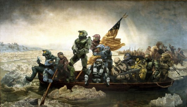
From the album: Funny Halo Pictures
-
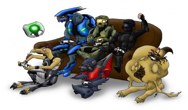
From the album: Funny Halo Pictures
-
From the album: Funny Halo Pictures
-
Survivor just doesn't sound fair to the ones who manage to kill a vehicle.
-
I think the reason why your map has not increased in downloads is because people look at the screenshots and then click off of your map post if they don't like what they see. That's how it works. A lot of people wouldn't even read your map description and rush straight to the pictures. And I'm guessing that they didn't download your map because they didn't like how it looked from the screenshots. But I can help you test. So can http://halocustoms.com/customs/upcoming My GT is Zandril S312. Just invite me when you see me online and chances are I'll accept your invite. Unless I was in the middle of something.
-
Get over it dude. Just enjoy yourself. Don't like H4, go play H3
- 9 replies
-
- 1
-

-
- 343i
- Halo: Reach
- (and 1 more)
-
Hey guys, I recently made a map marker pack for all you Forgers out there. Updated Download Links http://www.mediafire.com/download/j9cabu50y5kdxpi/Zan%27s+Halo+4+Map+Markers+V5.zip http://www.4shared.com/zip/FcXWmuZj/Zans_Halo_4_Map_Markers_V5.html I explain what a map marker pack is and how to use it in this video. http://www.youtube.com/watch?v=fA29eVqrBl4 NOTE: My mic was having problems when I recorded the video. As a result, the audio is quite weak. If you guys find the video and the Map Marker Pack helpful, could you subscribe to my YouTube channel? I'd really appreciate it. Thanks! http://www.youtube.com/user/SirZandril __________________________________________________________________ If you don't want to watch the video, then I'll explain it here as well. I'm going to start off by making you take a look at two screenshots. This one and this one Now, which screenshot tells you more about the map? I don't know about you, but for me, it's the second one. All because spawns, flags, and weapons have been marked instead of a plain overview shot. That's basically what this Map Marker Pack is. It's a collection of PNG images that you can edit into your map's overview screenshot. V5 UPDATE Hey guys. Update time! This is the fifth version of my Map Marker Pack. What's new? - A new style for all weapons and vehicles. - More teleporters. Now with color! This is for maps with more than one pair of teleporters. - A new style for the armor abilities. PICTURES That's pretty much it. If you have any suggestions/complaints about the Map Marker Pack, let me know.
