

Silent Orbis
-
Posts
559 -
Joined
-
Last visited
-
Days Won
2
1 Follower

Recent Profile Visitors


Silent Orbis's Achievements
-
Wow… been a while. Vivid memories of logging on as a 12 year old after school everyday. Now I’m 21! It’s nuts. Maybe I can get more active again for Infinite.
")
-
-
 1
1
-
- Report
-
Don't wanna be harsh, but this is in good intention, trust me. You're going to have to work on it a lot more. You're probably going to have to reduce flatness (trust me on this, I've had some key advice from 0micron about this, if you know who that is). Other than that, I'm not too knowledgable about BTB layouts, I'm gonna guess it plays fine. You also will probably need a LOT more detail aesthetics-wise. This looks like how a map would've been during Forge's very first month in Halo 5. Really take advantage of those textures, they'll take you a LONG ways. Maybe use some frost overllays here and there, wherever it's suitable. and it's especially SUCH a perfect oppurtinity to use the frost since you have a snow map. Roll the fog up a little maybe, also utilize the snowy weather effect. I do love what you're getting at with the lights though, with that color and everything. Make sure the settings are set to "Point", and also go down to effects and I think if you did the candlelight effect at a rate of 1.3 or something around there, it would be beautiful. Now I understand it's a paintball styled map, which is great. But the details that I'm suggesting won't take away from that. With flatness, don't go overboard with hills and stuff, but I recommend adding a little bit more elevation variation. The structures look cool, I personally would add some sand bags all around up there if I was you, but that's your choice. You can go ahead and message me on Xbox Live at Dezert Fuze if you want me to show you some of the things I'm talking about. But it looks really cool, and unique. Trust me though, it's going to take more weeks for you to really get this "done". And I put quotation marks because no map is ever really done. But you can get pretty damn close, and I'd say you probably need some more playtesting, some expert advice with the layout of it all, and you'll be solid. But that's just my opinion.
-
Server browser's coming tho.
-
Good stuff haha funny to come back to this after so long xD
-
What did you all think of my map submission?
- Show previous comments 2 more
-

Ouch guys.
-

Actually, I have no idea. Can you link me?
-
The Counter Strike map and Siege are obviously aesthetically pleasing, but I haven't been on live to play test those maps.
-
Alright guys, check out what I've been putting so much heart and soul into for the past weeks: http://www.343industries.org/forum/topic/44431-dead-village-by-dezert-fuze/
-
Gamertag: Dezert Fuze Player Count: 3-16, anything that works with standard Infection Download: https://www.halowaypoint.com/en-us/games/halo-5-guardians/xbox-one/map-variants?lastModifiedFilter=Everything&sortOrder=BookmarkCount&page=1&gamertag=Dezert%20Fuze#ugc_halo-5-guardians_xbox-one_mapvariant_Dezert%20Fuze_61610aee-3529-4ed5-86a9-384ead83139d Ruins of an ancient village worn, used for natural resources and human experiments. It took a turn for the worst. My first ForgeHub submission ever. Also, my first contest submission -- for the Hub of the Dead contest. My second submission to this forum, my last one was kind of a fail. xD Anyway: This map is what could be considered anything from small to mid-sized. It is walled-off all around, and in that sense is blocky. However, this "blockiness" is not blocky in a bad way, rather contributes to the story and "ancient village" aesthetics. It is countered by a flaming crane, an arch, some enclosing hills, and more outside of the playable area. Weapons: -DMR x1 -Shotgun x3 -Assault Rifle x3 -Hydra Launcher x1 -SAW x1 -Secret You-Know-What x1 ( Try to find it ) Grenades: -Splinter x5 -Frag x6 The layout is made in such a way where holdouts can be seen everywhere you turn, giving survivors an advantage. To balance that factor, verticality is added in a way where it is easier for the infected to get up than it is for the survivors, and the ground level is separated from the upper level, with slopes and crates that can be used as a transition from one to another. If survivors choose to hold out somewhere on the upper levels, the sightlines have been covered by huge chunks of rock, and also the broadness of the upper ground. What I mean by broadness of the upper ground, is the the upper level's fooring on buildings, is also the roofing of those same buildings. When the buildings are broad and big from the outside, the roof one is holding-out on top of is also very broad. This allows for the infected to sneak in through those very buildings, and exit through the many different points on the in those buildings, then jump up to the top from whichever angle they choose. The map naturally balances gameplay between the survivors and the infected, making it challenging, adventurous, fun, and advantageous for everyone. Another thing I've been told is that the map is reminiscent of Modern Warfare 3, Halo 3, and Counter-Strike GO in its feel. With the aesthetics, I'm personally someone who cares a LOT about the way things look. Whether it's a photoshop project, the neatness of an essay for school, or a forge map. I also enjoy making the aesthetics and layout inseperable from each other, giving the map a meaning and a purpose. In many cases I see forge maps that have very good layout, and are fun to play on. However, a map that has this good layout, yet lacks aesthetic detail and sophistication, is a map that isn't good in my eyes (not jabbing at anyone's maps, I'm talking about the process behind the one's I try to make). So, I decided to make it an ancient desert village, with the layout being perfect for the gamemode, as well as the aesthetics being unique. The aesthetic detail is inspired by Middle Eastern designs in the real-world, with some minor differences (I'm assuming that this isn't on Earth, so the "Middle-East" might not be the Earth Middle-East). I decided to keep the map in a daytime setting, to emphasize the sun, heat, and desert setting. Also, I felt dark and scary maps were too stereotypical, and I experimented with the idea that fear is possible without physical darkness, rather the mood of it is deserted (pun intended) and dark without the night sky. This is due to the fact that there are miscellaneous dead bodies and skulls, and also that this in itself is a village -- but where did the people go? That's the question I want people to ask, and that is enough to be able to avoid being unoriginal by making it dark. Also, I wanted to give my thanks to WyvernZu, MYTHICALTWINKIE, and xNFx MoNsTa (all really good forgers) for looking at my map, and giving me advice/suggestions. I also want to mention that I ran many playtests, and tried to listen to what everyone else said besides me, so I could have a very fair and people-oriented map. After all, it is for playing.
- 1 reply
-
- 7
-
-
That's so interesting, that's exactly what I was experimenting there with. Like, does the darker it looks necessarilly mean that it's creepier. haha thanks for your opinion
-
I love you for this.
-
Done.
-
So Option 2?
-
I mean... If you voted I wouldn't mind... xP
-
I need as many peoples' opinions as quick as I can on this poll. Each one makes a difference!
http://www.343industries.org/forum/topic/44424-an-urgent-forge-poll-d/?do=findComment&comment=385849http://www.343industries.org/forum/topic/44424-an-urgent-forge-poll-d/?do=findComment&comment=385849http://www.343industries.org/forum/topic/44424-an-urgent-forge-poll-d/?do=findComment&comment=385849http://www.343industries.org/forum/topic/44424-an-urgent-forge-poll-d/?do=findComment&comment=385849-

I think you made a booboo
-
-
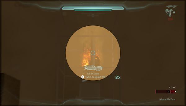
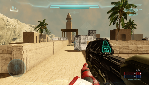
Hey guys, long time. I'm working on a project for the Hub of the Dead Infection-Map contest over at Forge Hub! So, I have most of it done. Now I'm just confused over one little detail. That has to do with the way the sky looks. Now, I'm going to give you guys two images that don't have too much stuff from the entire map, and are from an older version, but that's okay, because technically I haven't "revealed" it to any forum yet. I'm going to have descriptions for each one, and so that'll tell you whatever you can't gather from the pictures (which will probably be a lot of stuff). So I want you guys to either vote for option 1, or option 2 as a lighting setup. Don't forget, this is an infection map. OPTION 1: This is a daylight option. It's bright, has lots of sunlight, a sandy atmosphere, slightly cloudy but has bluish sky. Performance and light-baking is slightly better on this setup. It looks similar to WyvernZu's lighting on her Sandtrap remake. OPTION 2: This option is not a night option by any stretch of the imagination, as the huge sun on parallax shines through everything. But it is noticeably darker, has a slightly thicker sand effect and is also just a more effed up day time. One thing to note is that performance with the light-baking is worse than Option 1, and some pieces look a tiny bit glitchy (nothing that you can notice unless you look really carefully). So that's that! Basically, I'm not sure of a scary vibe needs a darker lighting necessarily. I've been told that my map feels like it was once lived in, and something happened where people died/can't be there anymore, and this was with Option 1 on. So, that's the thing. It's an infection map, so a sketchiness is favorable. But, if it can be achieved without having to be physically darker, it's fine. Anyway, thanks and vote if you read this! NOTE: The reason I said urgent was because there's only around a week left.
-
Any work by me is posted here.
-