


THESLAMMERSS
-
Posts
21 -
Joined
-
Last visited
Content Type
Profiles
Halo Articles
Forums
Events
Gallery
Books
Movies
Posts posted by THESLAMMERSS
-
-
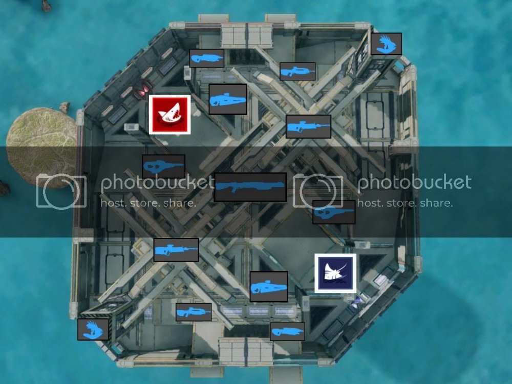
Took a look at the map. Some lazy cover at one area but for the most part, it looks like a really good map. I think it's gonna play very well.I did find some potential problems with it though.____________________________________________There were some pieces that struck me us unnecessary.One of these being the small platform that the Concussion Rifle is resting on. I think that are would do without it.Another would be the wall dividing the ramp that leads to the Concussion Rifle. This makes walking up the ramp feel a little too tight and I think movement in that area would be better with the walls removed.I also see some problems with the weapons an powerups. This map is for 2v2 and 1v1, yes? Then I suggest removing the Overshield. For 2v2, OS should be fine but if you throw 1v1 into the mix...Then there's the Concussion Rifle placement. You put it in a location where Red team is guaranteed to have it. Sure Blue can chuck grenades in there but the result is usually inevitable. Which is Red having that power weapon.You may say that the Blues in return have better access to the Sniper but I don't think that is good enough.What I would do is only have the Concussion Rifle spawn at the start of the match and have the Sniper spawn later on. Then, I'd set the initial spawns to where both teams will be fighting for the Concussion Rifle at the start of a match.This set up tends to work pretty well for 1v1/2v2 maps.There were also some narrow paths somewhere in Blue base that I think made the paths too tight.Also found an unnecessary respawn point near Blue spawn. It was placed at a very advantageous height. I suggest removing this respawn point. You want players fighting for the height advantage. Not having it handed to them at spawn._____________________________Well, that's all I got. Keep in mind that my feedback is based off of observation in Forge mode. I haven't played the map. We should add this map to our 1v1 battles.

Thank you Zan for taking a look into this, yes we will definitely add this into our 1v1 pool.
I agree with you about all the points you bring up but two,
1. The angled wall in the middle of the ramp is meant to be a jump up towards what use to be over-shield spawn.
2. The narrow hallways by blue, yes technically i agree with you, but i spent so much time trying to stay "inside the map" as my map kisses both boundaries towards the base map and the external kill boundary. If i try to open it up the player will be sucked into the map and get glued to the wall. I wish i had more room to forge out there, due to my mistake of turning the map 45 degrees. Though the narrow hallways are not that bad during the game play i have seen.
Thanks again Zan ill make these modifications asap!
-
Syntax is a modded 1v1 to 2v2 map, sorry if people hate this but I absolutely love the pallet and I decided to make a map on it. So here we go, no pics (again im sorry) but here is a video
")
~TS
-
Looks very interesting with the window pieces. Which is kinda odd to see if you where in a real warehouse which has normal soild, thick walls. Feels a lot like foundry nice work.
-
"Someone, anyone, Please respond" lol but actually I really would appreciate any feedback
always looking for improvement so please comment on anything -
video of Koth gameplay now up
-
love the layout Blaze. really interesting concept you use. a forging style that results in forcing players to make tough decisions quickly. Defiantly gave this a DL.
will have more feedback laterz. but looking at these pictures i feel the large flat areas at both blue and red sides are a little plain. maybe try to create some structures that ties together a common theme with the rest of the map.cant wait to see more -
Can two people work on a map together equally (not a friend who just comes in and adds a small detail but someone, who, from the beginning was helping the other person collaborate and build)?
-
Video has been uploaded!

-
Hey slammers, played a 2v2 on this last night! I guess I played the updated version, cause I didn't see any of the elements that are critiqued in this thread!
This map is very loci, your theme is continuous , without repetition! Great to see a map without a bunch of brace larges, (No offense Brace Large I love and use you in every build).
I find it rare when people use banks as fixtures, and cover or ornamentation, I really enjoyed this part of the map!
I thought it played, and looked really good! The signature of the build is so smooth, and really stands out!
Nice to meet you!
Yes I have updated the map and have no new feedback to which to improve on yet
Loci? What is this lol
As for brace larges yes I even used covers to well cover up the under side of the most visible ones at needler spawn.
Do you have any thoughts on what I could improve on? Great to hear gameplay turning out great
-
Thank you BrokeBackHill, i strive to make my maps clean and detailed. i put aesthetics at par with game play to maximize the game experience
Map has been updated.
things changed:
The railing in the middle of the doors from bases towards green.
Added details to needler spawn
Moved the base stripes out for easier use
Thank for the feed back
-
 1
1
-
-
Zan!!!!! Great map i love the layout of the different zones. though red kind bugs me feels too...white lol needs more pzazz. don't worry ill help
 Aesthetics man to the rescue!!!
 -
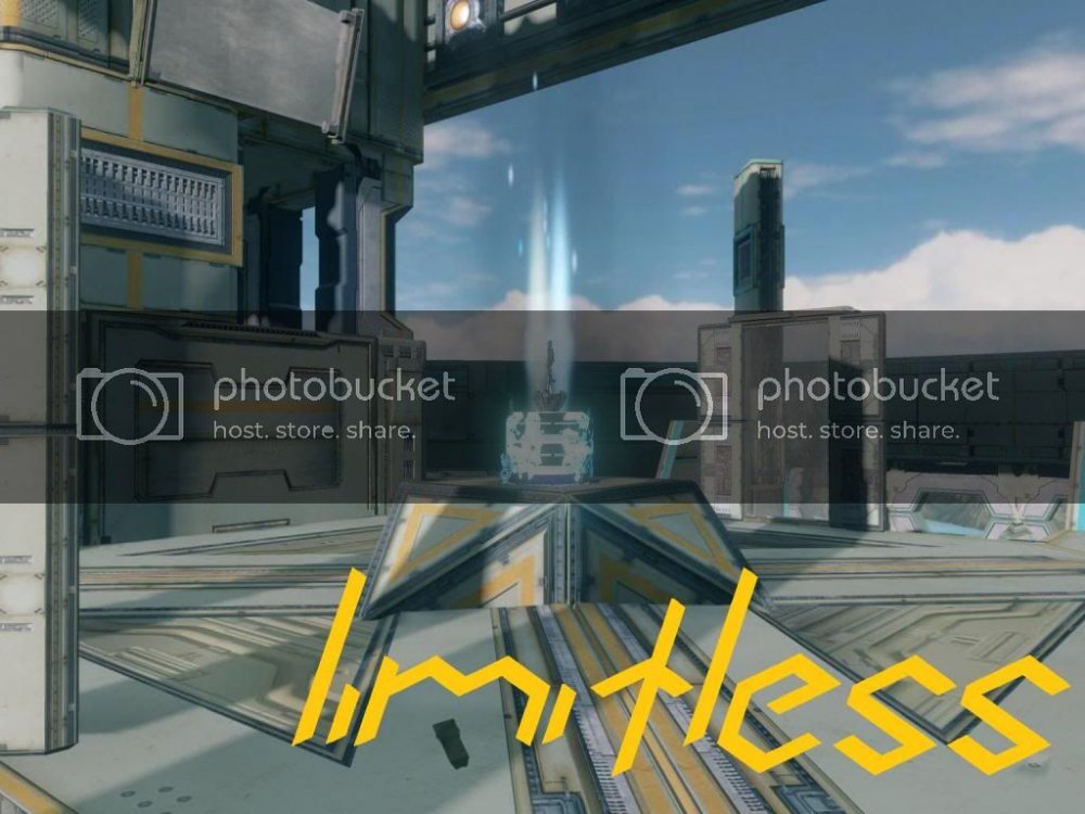
Limitless
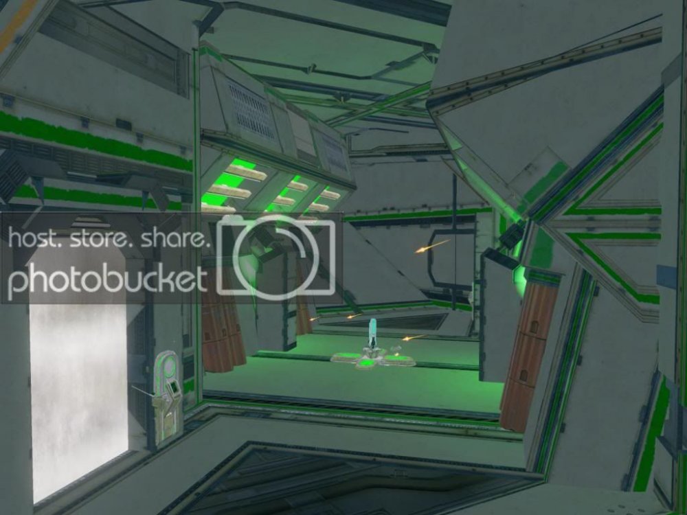
Made by: THE SLAMMERSS
Limitless is a small 2v2 to 4v4 symmetrical CQC arena. Limitless was originally built on Impact but due to frame rate issue was rebuilt on forge island and fine tuned. Limitless was designed to feel like the player is on top of the world, which they basically are as the map was built near the top of forge island.
Images:
-
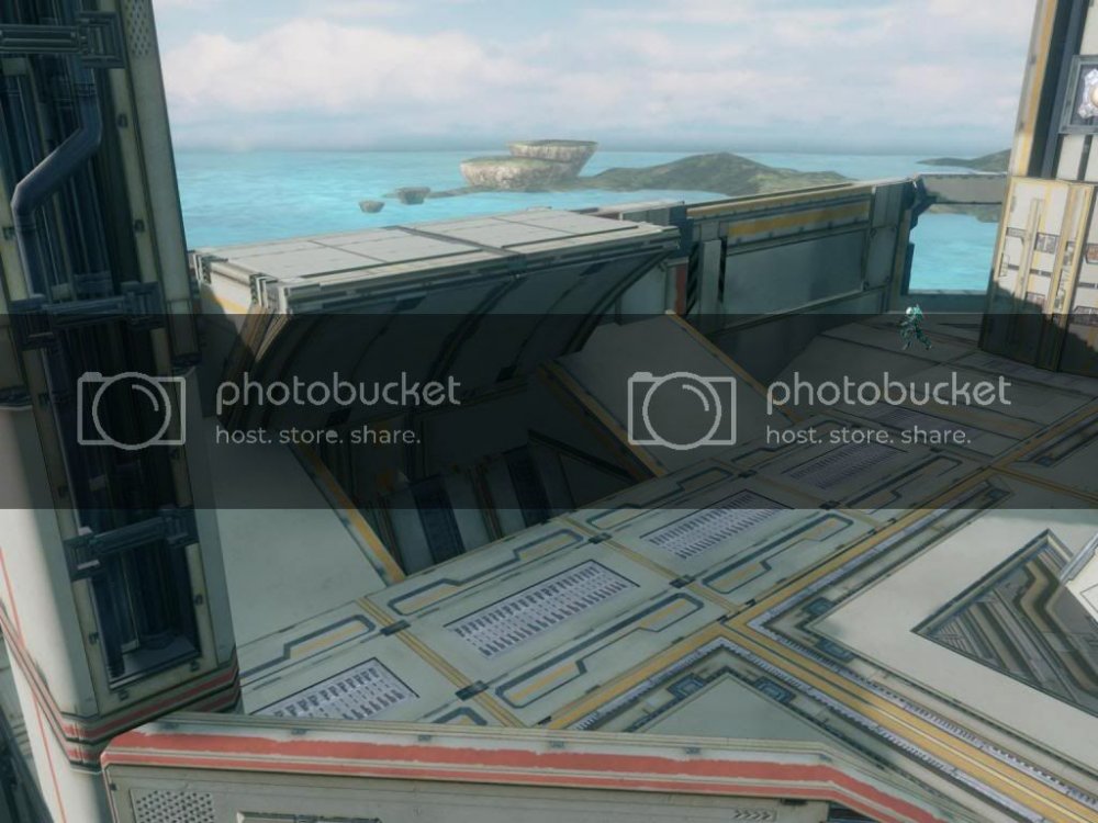
NEW UPDATED VERSION UP
ps the first pic was just to bad ass to get rid of so just a side note the glass wall HAS been removed for the actual map. Thank you guys -
Wow the level of details in this map are fantastic. i love the forerunner look of the entrances. great work. i am defiantly DL-ing this.
-
You gonna be able to join the CGN this week? I'm still interested in featuring this map.
Possibly idk :/ I hope so but can't be sure
-
I understand the "aesthetics" side of it, but it's unnecessary and redundant cover that clutters the map and limits movement in that area.
Ok i can see that and walking around i did get that feeling i just ignored it beause aesthetics sometimes blinds me from game play
-
I gotta say, I was pleasantly surprised with this map. The overall layout feels very good for a fast paced 4V4. However, with the way things stand right now, it may be a little TOO fast. I'll get to that. ANYWAY! On to areas of the map that I feel could be improved.
GREEN: Green was the first thing that grabbed my attention when running around the map in Forge. While the aesthetics are great, the structure jutting out of the floor makes the area feel a little awkward to move through, it really breaks the flow. I would scrap the middle structure, and focus more on the pip structures on the side. Flesh those out a little to create a choke point and add some cover.
THE BASES: The bases feel pretty good as they are right now. My concern is the areas directly outside the bases. The doorways to the left of each spawn feel a little cramped to walk through. Try opening those up a little. Also, add a roof on top of the halls where BR spawns. This would double as dancefloor up top, and add some segmentation to the map.
The ramp leading to top mid from each base feels a little bare. I suggest getting rid of the glass cover at the top of each ramp (it just feels lazy), and converting each of the cover pieces on either side of the ramps (the ones holding the Carbines and LRs) into full walls to break up sightlines a bit.
NEEDLER SPAWNS: These areas aren't too bad, they feel just a tad bit cramped. Remember, everything is gonna feel smaller and more chaotic when in game as opposed to just running around in forge. The piece usage here could also be better. The structure itself just looks and feels a little awkward, but nothing too major
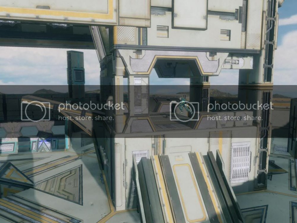
TOWERS: I REALLY like what you were going for with the towers. My only problem is that they're a little too enclosed and campable, even with the multiple ways up. Try redesigning them to be more exposed to fire from the lower levels, making them a slightly less viable option to hold out in. Also, maybe experiment with a thin bridge connecting the two, just to add flow and options to the player (just a personal thought).
So, overall I'm really liking what I see. Try implementing everything I mentioned along with some cleaner forging in some areas (like the 4X4 Flat floors, Green, and the towers) and this will definitely start standing out more and more. Nicely done.
Laterz!
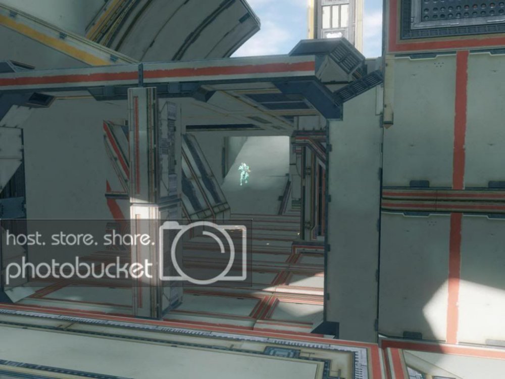
Thank you Squally! I will work on revising this over the weekend. one side note, i used dominion glass monitors as a wall to block but as the game starts and players run up the ramp they get a glimpse of the ordinance crashing into the extraction cells creating the first image posted. If u think i should remove these i might but as it stands it holds two purposes, cover and aesthetics. Thank you!
-
Can someone please look at this and give me any feedback. really appreciate it
Thank you -
Looks better than the Impact version, Slammers. Well done.
Were you able to test this during the FCCGN?
No i wasnt and wont be for a long time
 long story tell u more later but if u mind getting a proper test that would be great
 -
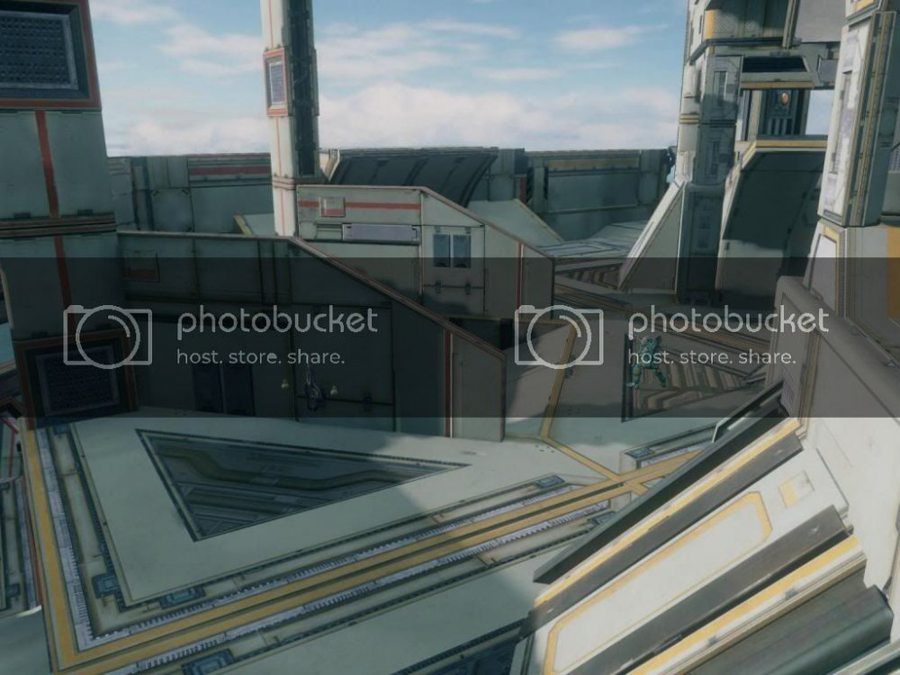
Limitless
Made by: THE SLAMMERSS
Limitless is a small 2v2 to 4v4 symmetrical CQC arena. Limitless was originally built on Impact but due to frame rate issue was rebuilt on forge island and fine tuned. Limitless was designed to feel like the player is on top of the world, which they basically are as the map was built near the top of forge island.
Video: Courtesy of Sir Zandril! Thanks Zan!
http://www.youtube.com/watch?v=fp7iQxcwSe4
Video 2: Courtesy of TheRagingBrutes! Koth gameplay
Images:
-
1
-


Silhouette
in Competitive Maps
Posted
Debonair dont worry about "necro bumping" , even Zan does it too. he just does it more often so it doesn't seem so bad love you Zan lol but you know its true *cough cough novus*. any way If your wanting feedback this really isn't the place. Sorry man from experience, doing the same thing as you, I noticed its best to get good feedback from a testing lobby. Just posting it online doesn't really achieve much. (warning this is not an insult to anyone reading this) But people just don't download someones map off the internet, then to play said map on their own free time, and then go back to the said website and write a post about someone else's map. People would rather test their own maps and call it a day. Send me a PM and when I'm on next Ill try to meet up with you and we can test this.
  For the record when i saw this on youtube i thought it was a beautiful map clean aesthetics, and nice defined paths.
~TS